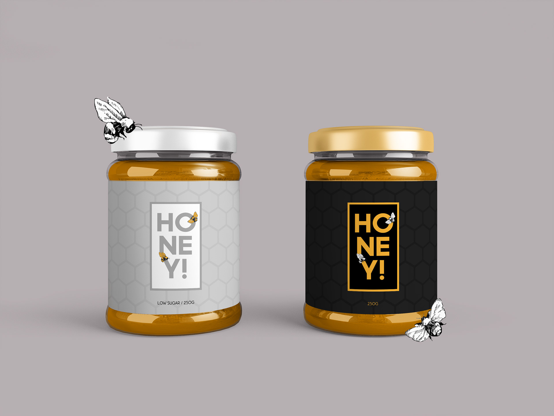
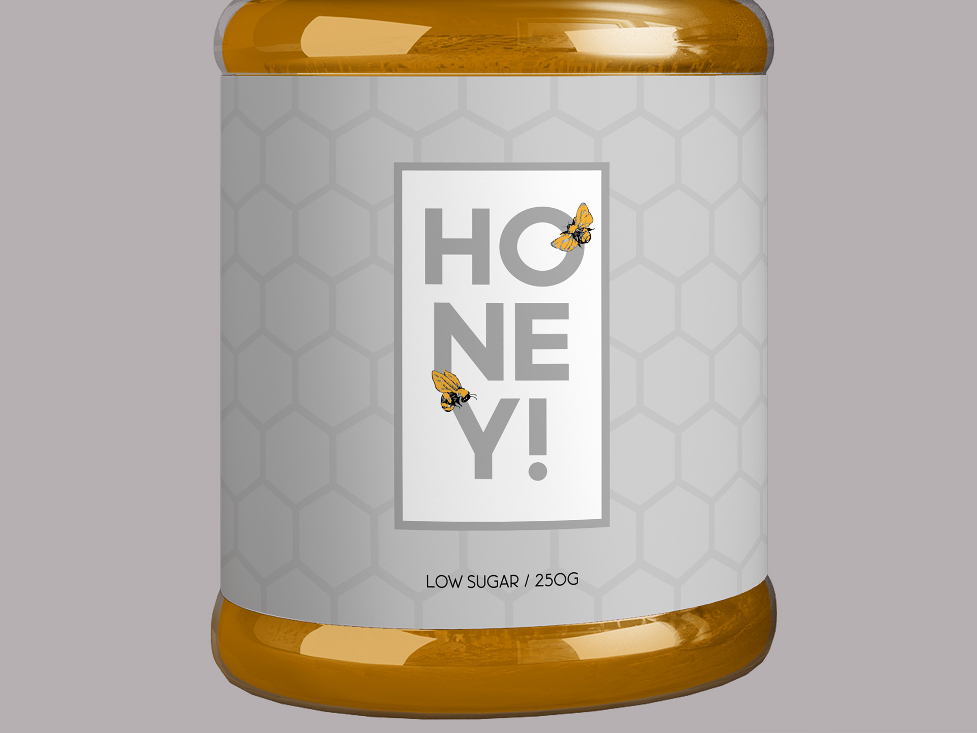
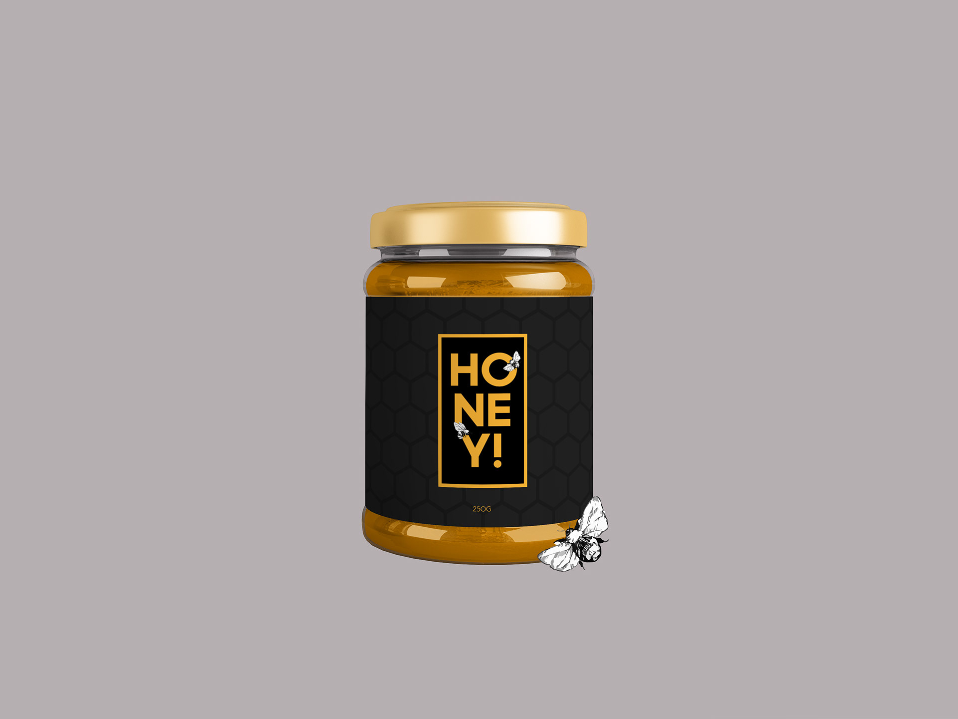
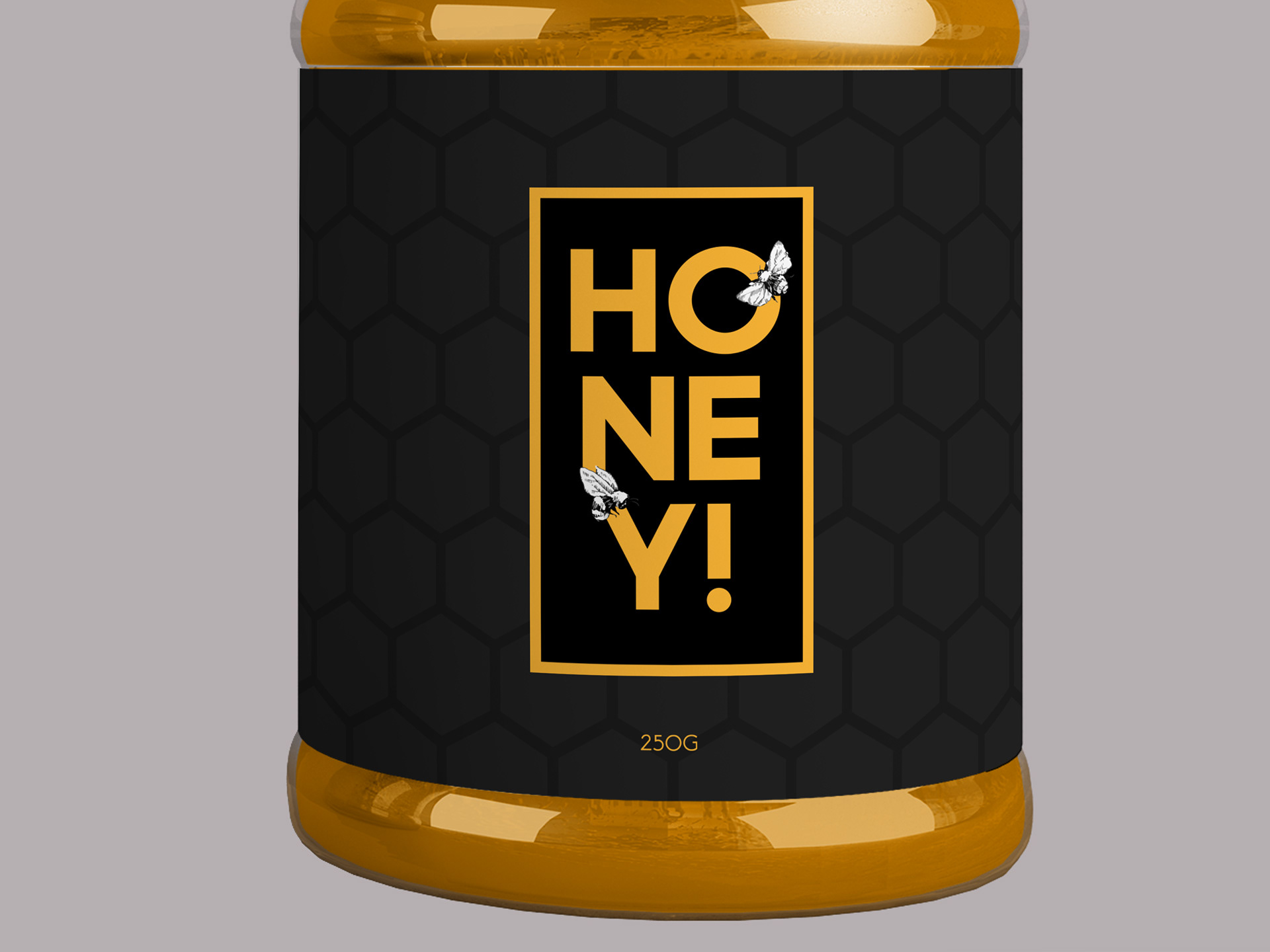
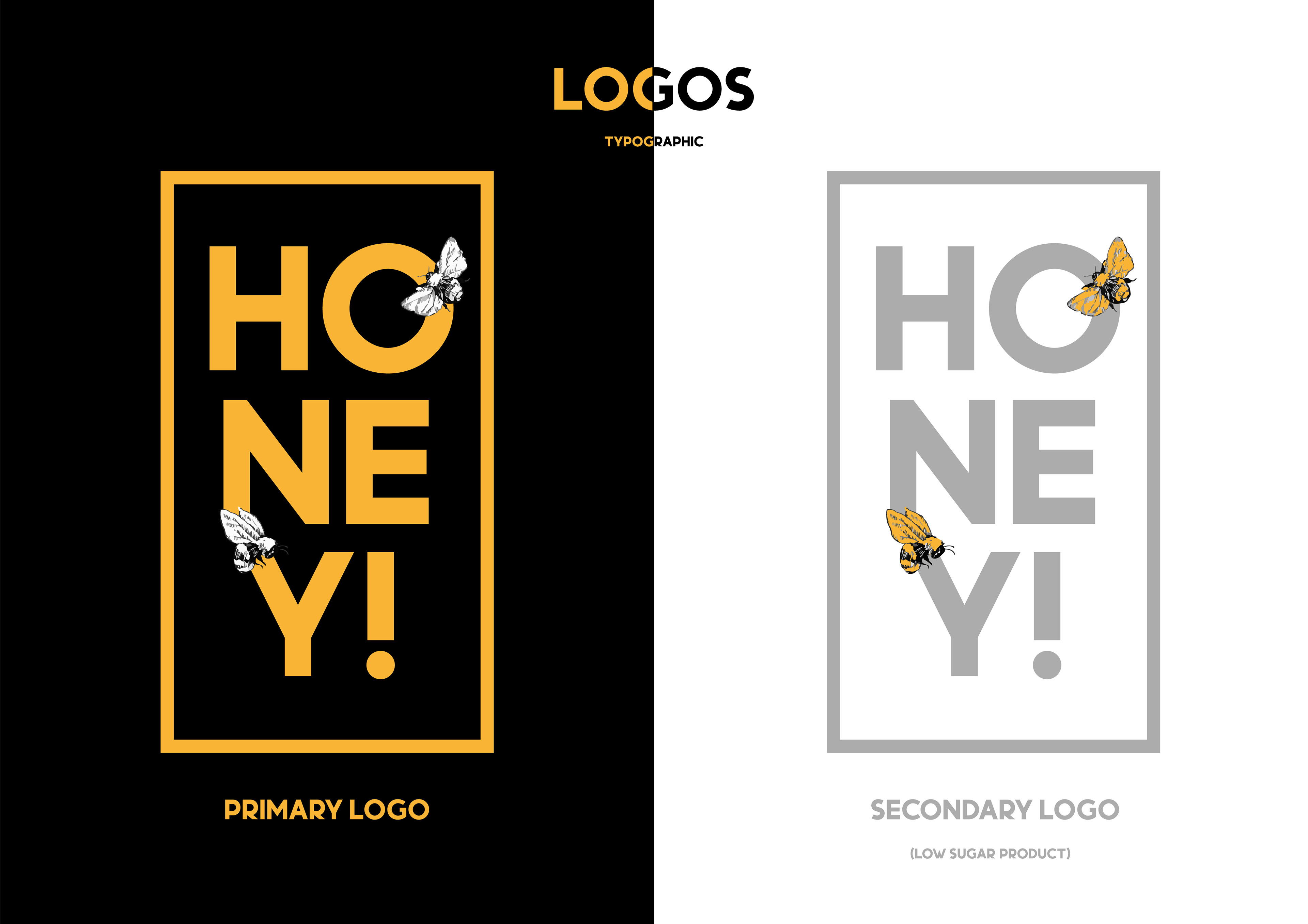
Honey! is a honey brand which follows a minimalistic style while also wanting to be visually appealing. Honey! wanted a packaging design which used vibrant colours to catch the buyer’s eye while also having a texture on the packaging which allows the buyer to have a physical interaction with the packaging. To start this project, I needed to produce a logo which spoke for the brand, the logo needed to make the brand feel professional and look/feel like an upper-market honey brand. I felt a sans-serif typeface would work well for the brand as this makes the brand seem serious and professional.
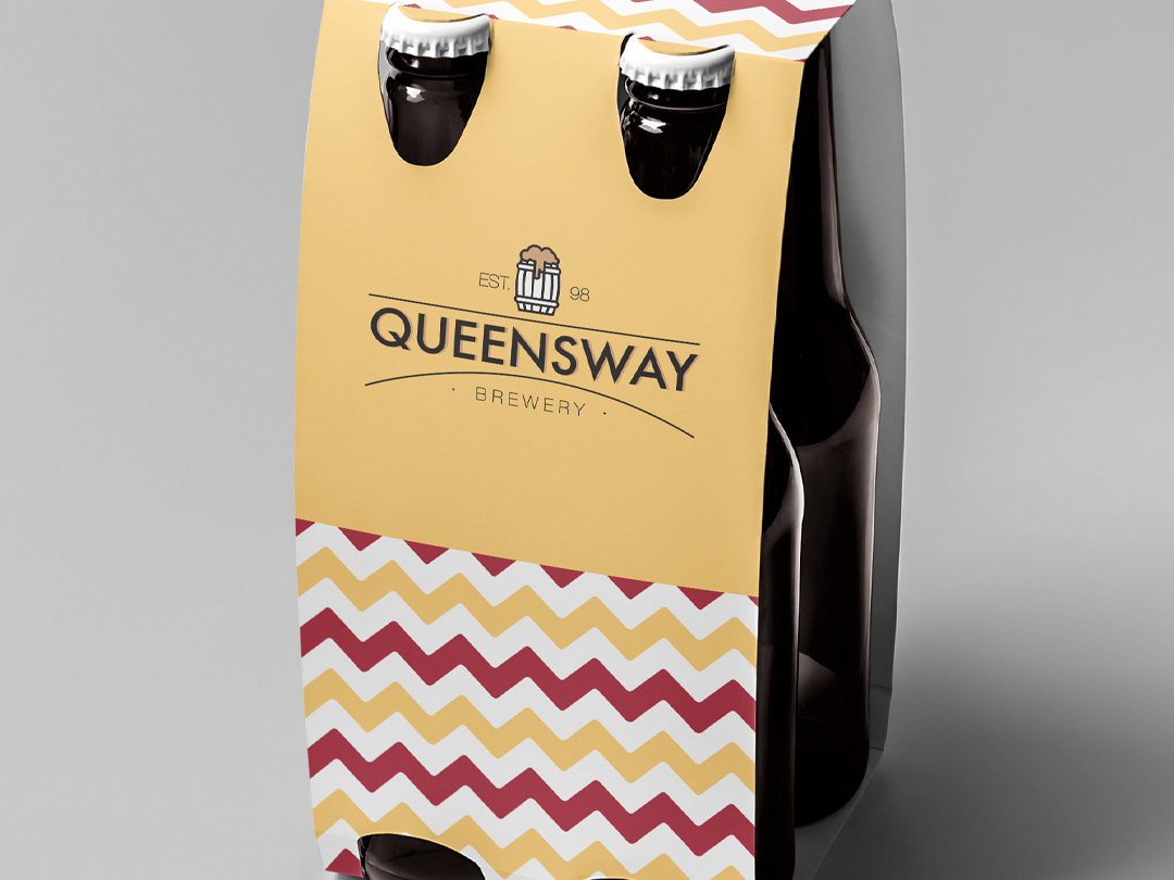
Product Design (Mockups)