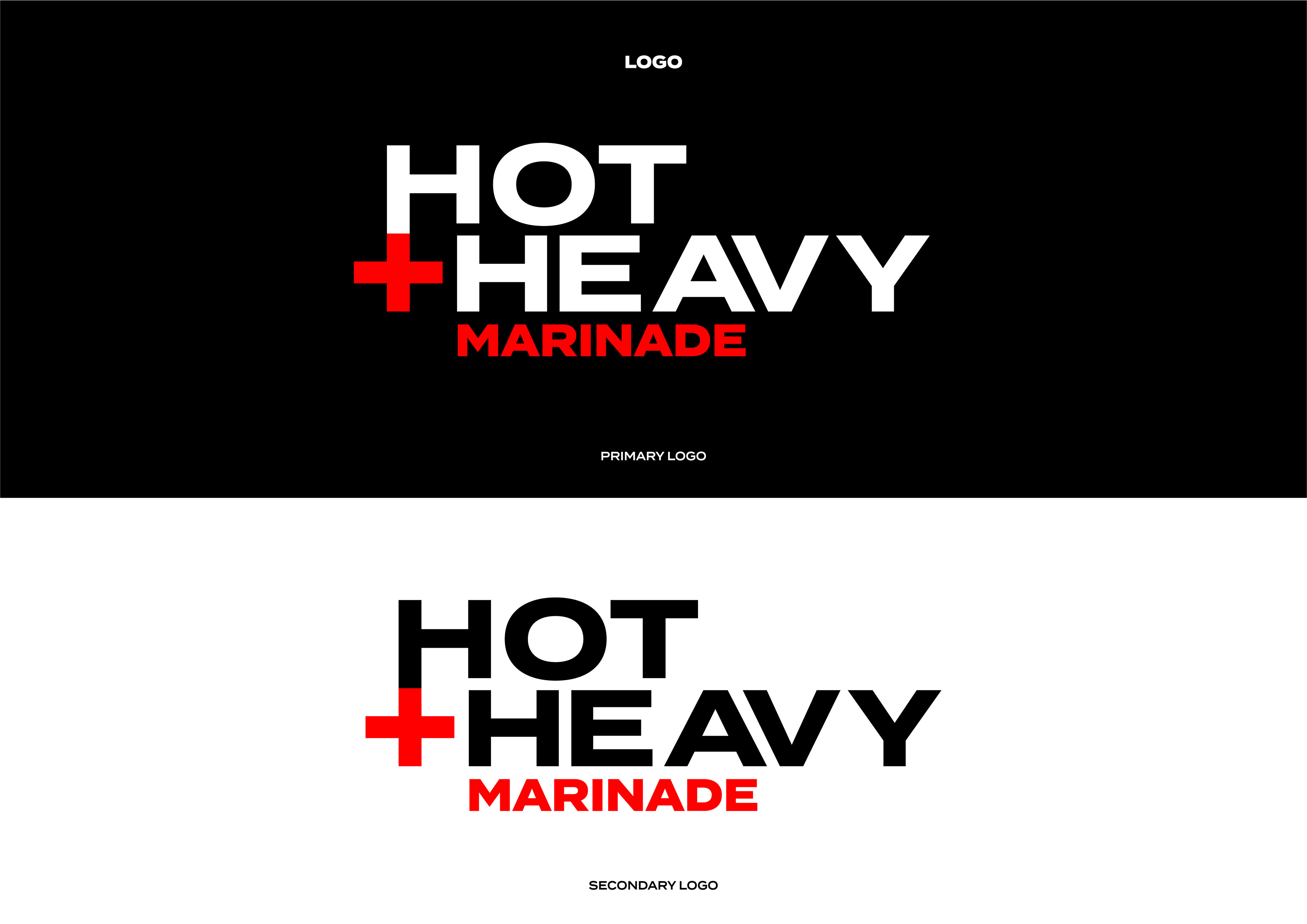
Hot + Heavy is a new marinade/sauce to impact the sauce market. With its rock and roll themed branding, its sure to catch the customers attention when walking down the shop aisle while viewing the other sauce products. As many marinade products have opted for safe colour, typography and imagery when designing their packaging, I felt this product needed to be unique, highlight the issue of how products play it safe when designing its packaging and also disrupt the market.
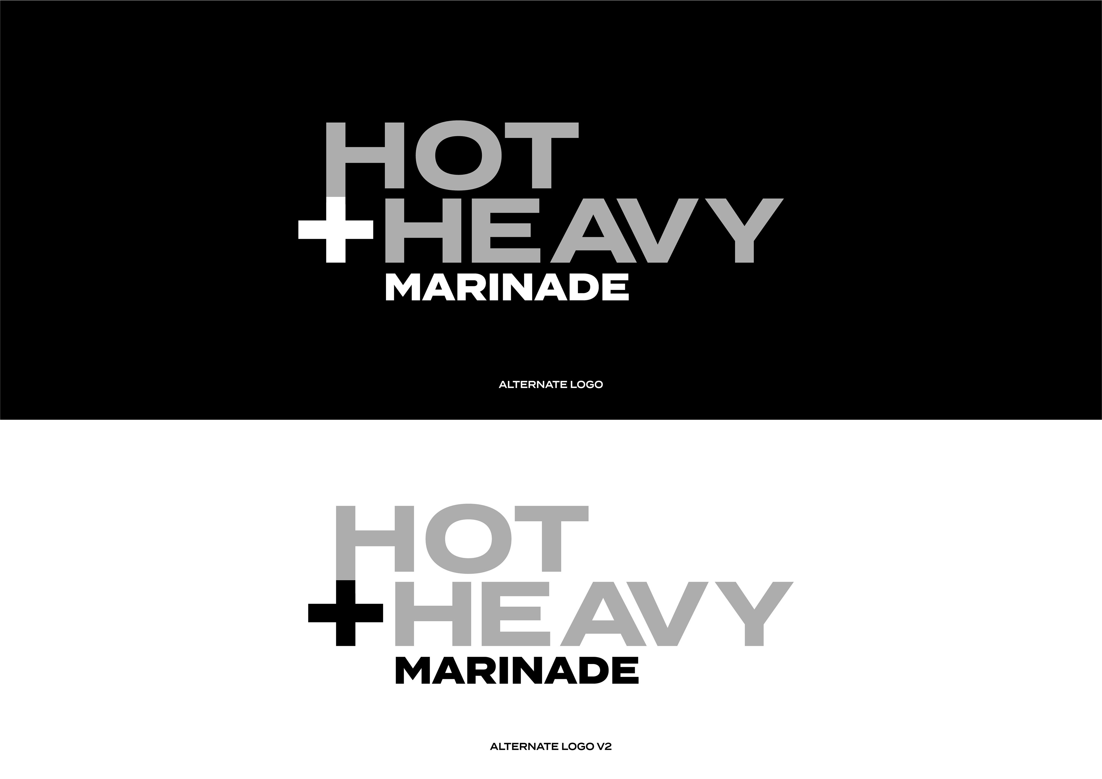
Below is the Brand logo with its logo alternatives and packaging design.

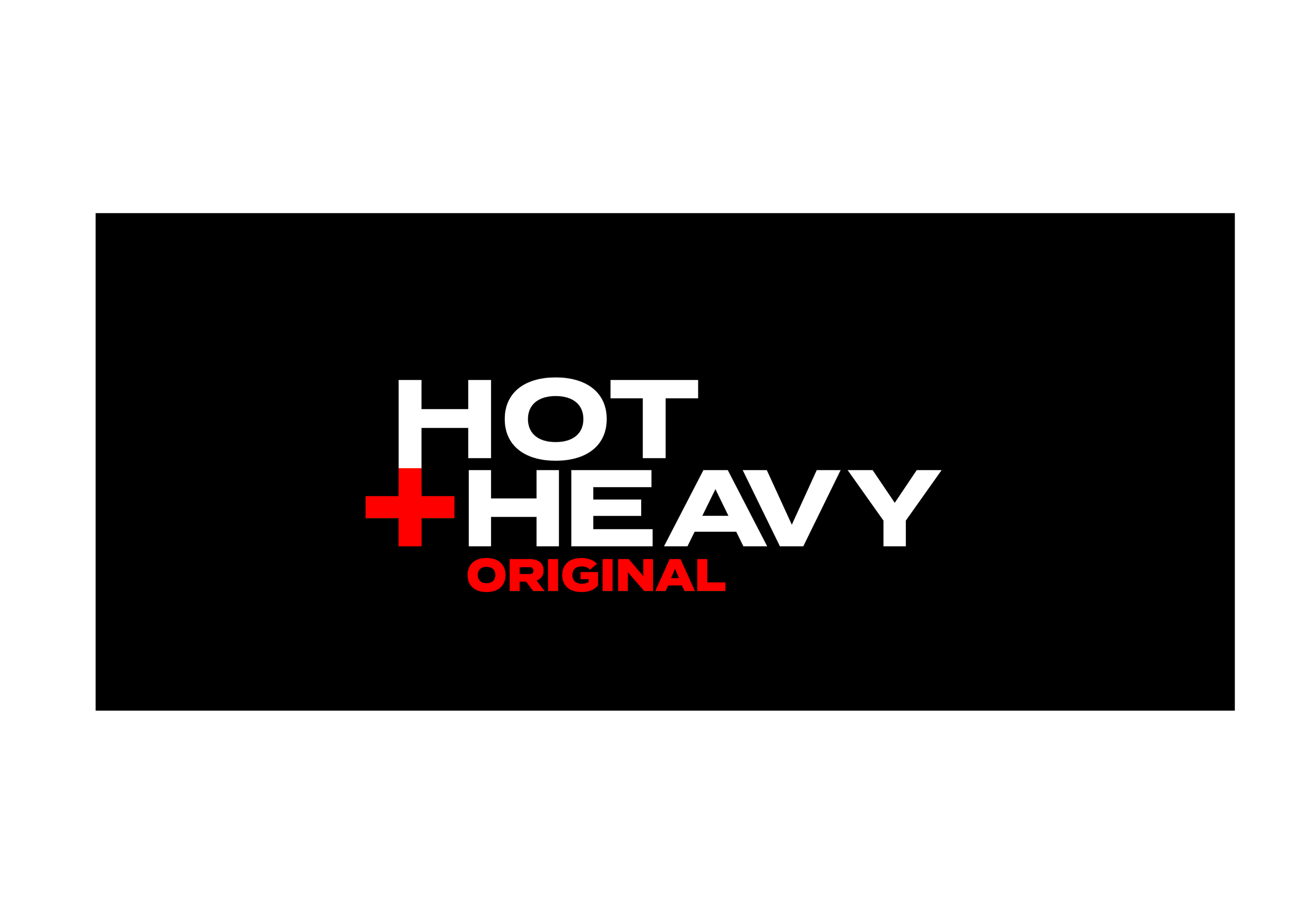
As Hot + Heavy have four products, I felt it was important to design the logo of the flavours while being consistent with the already established brand identity.
Below is the product logos showing each flavour.
Product Logos
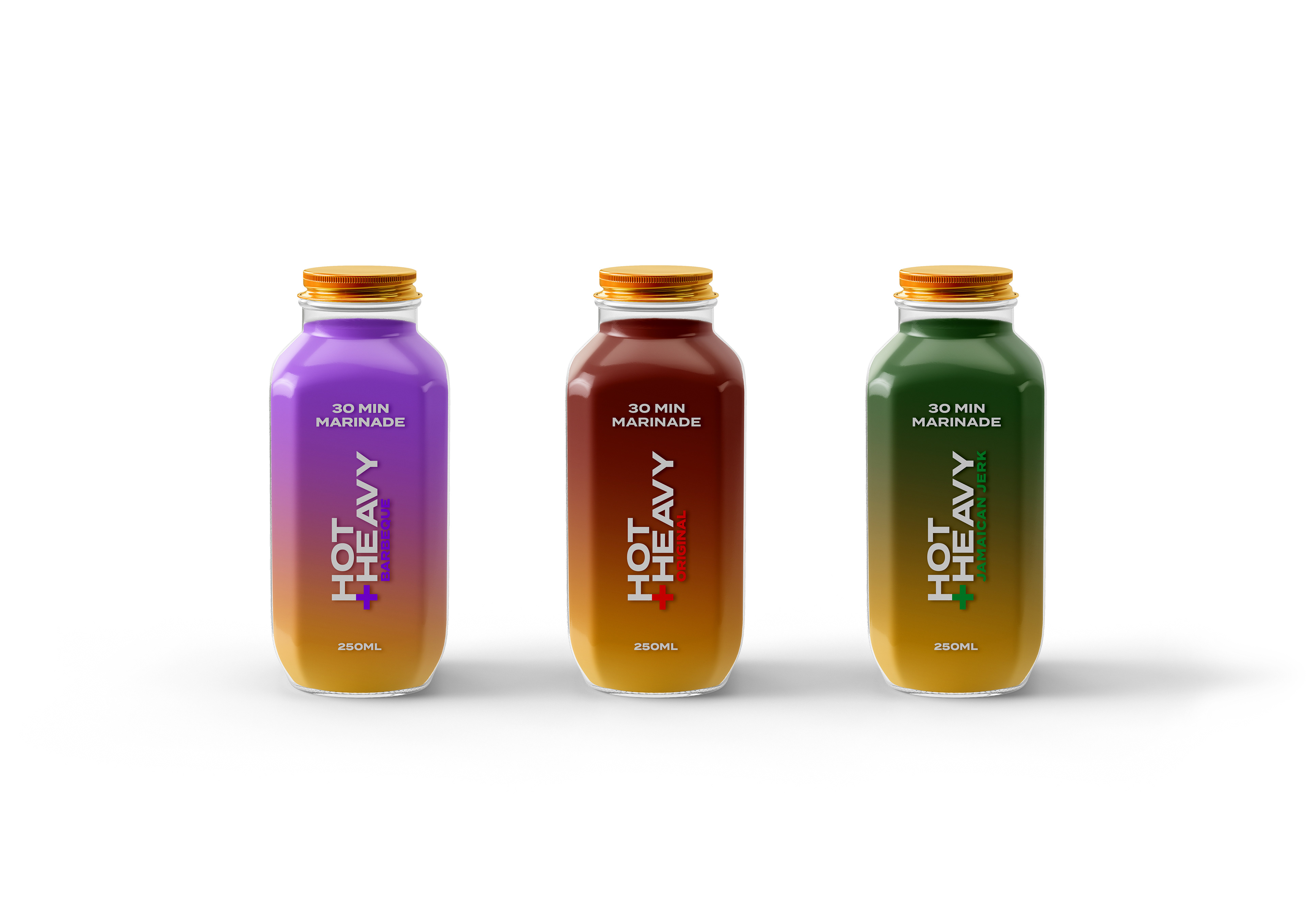
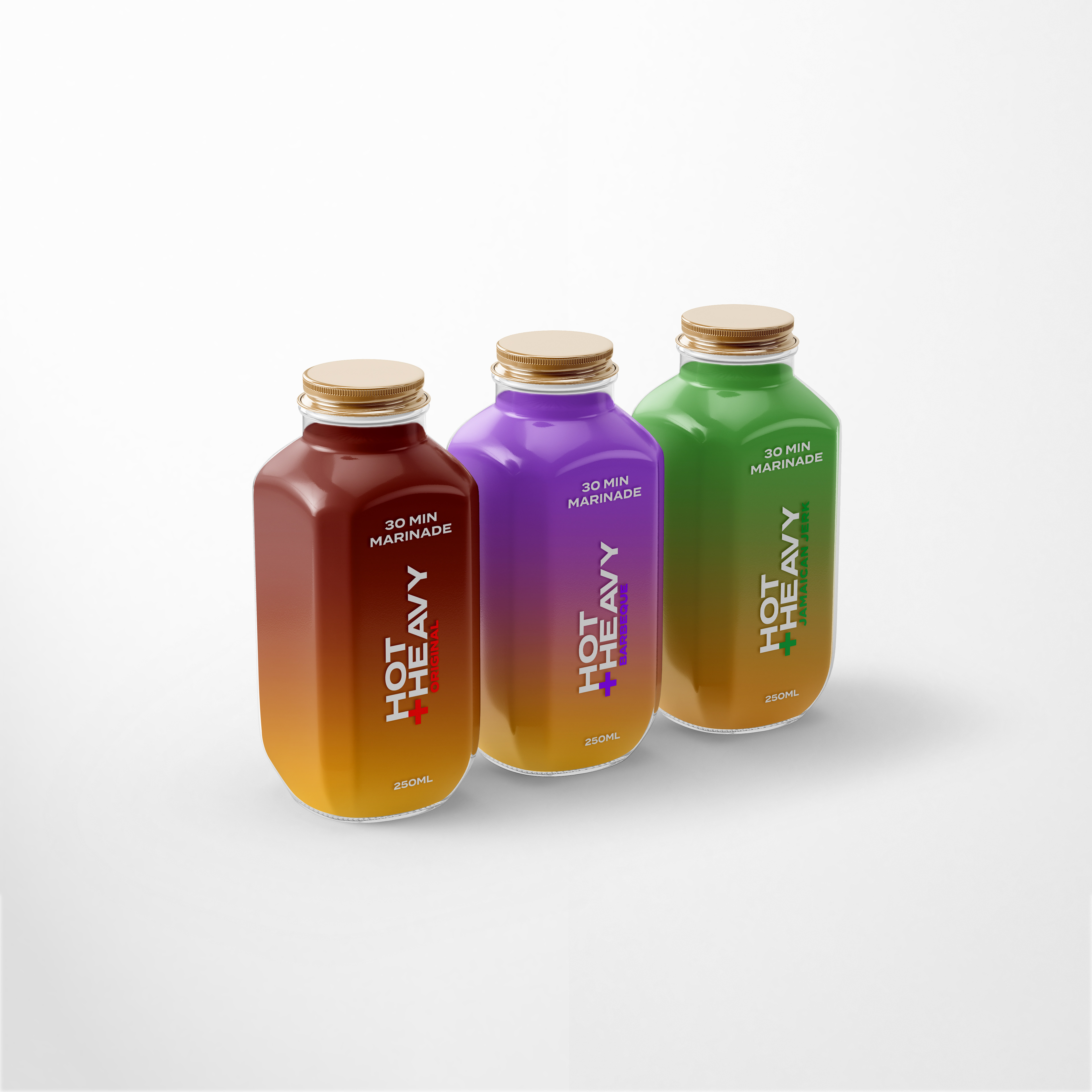
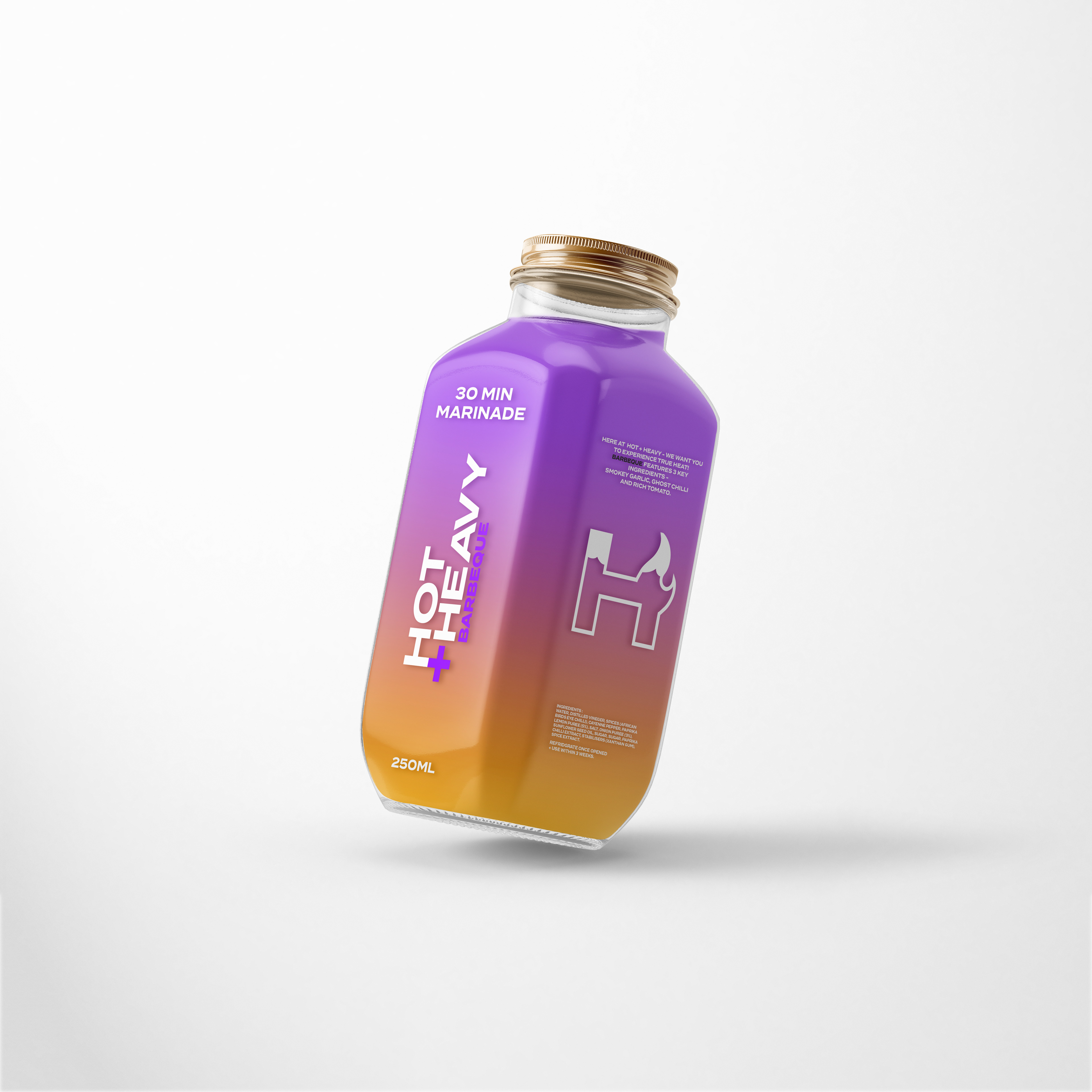
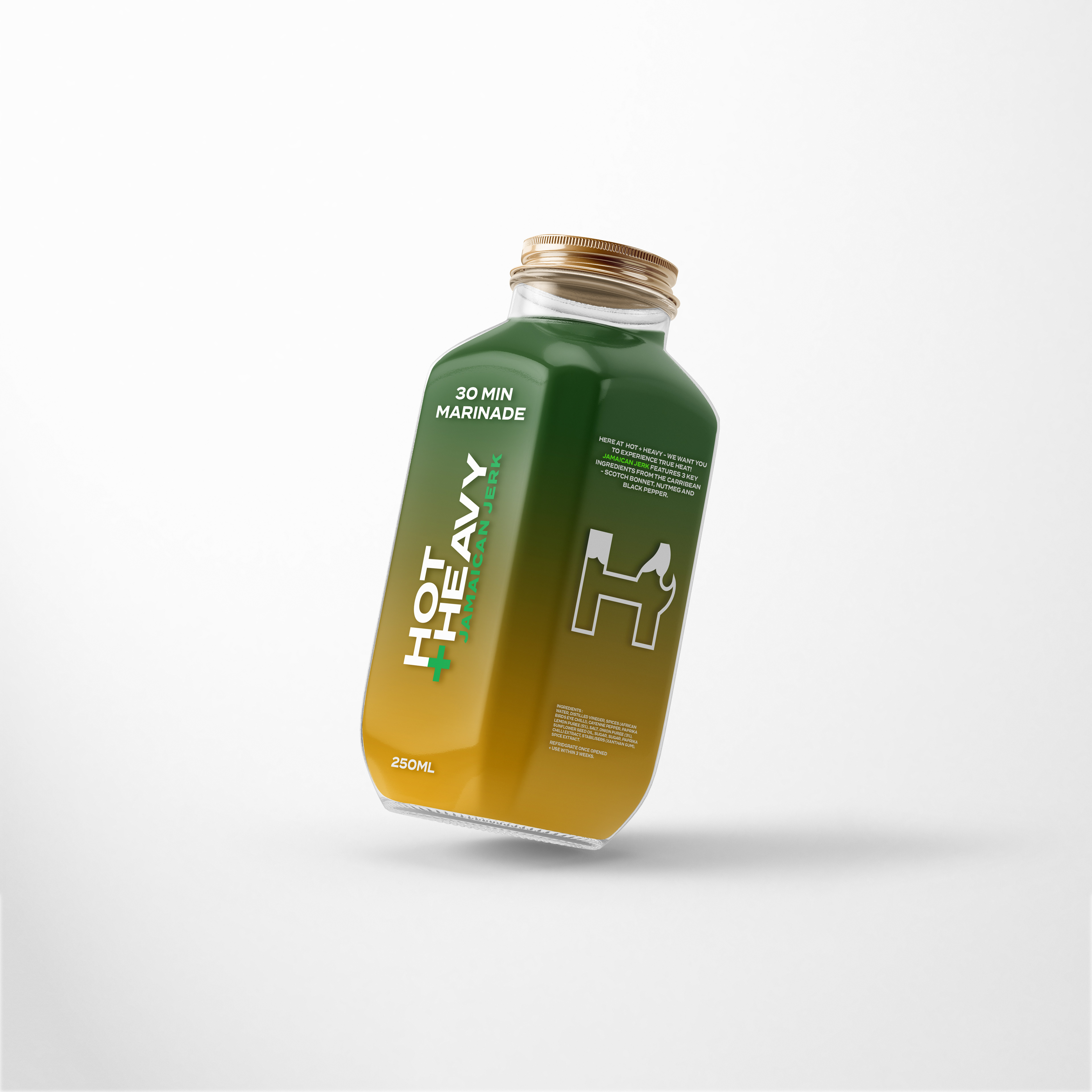
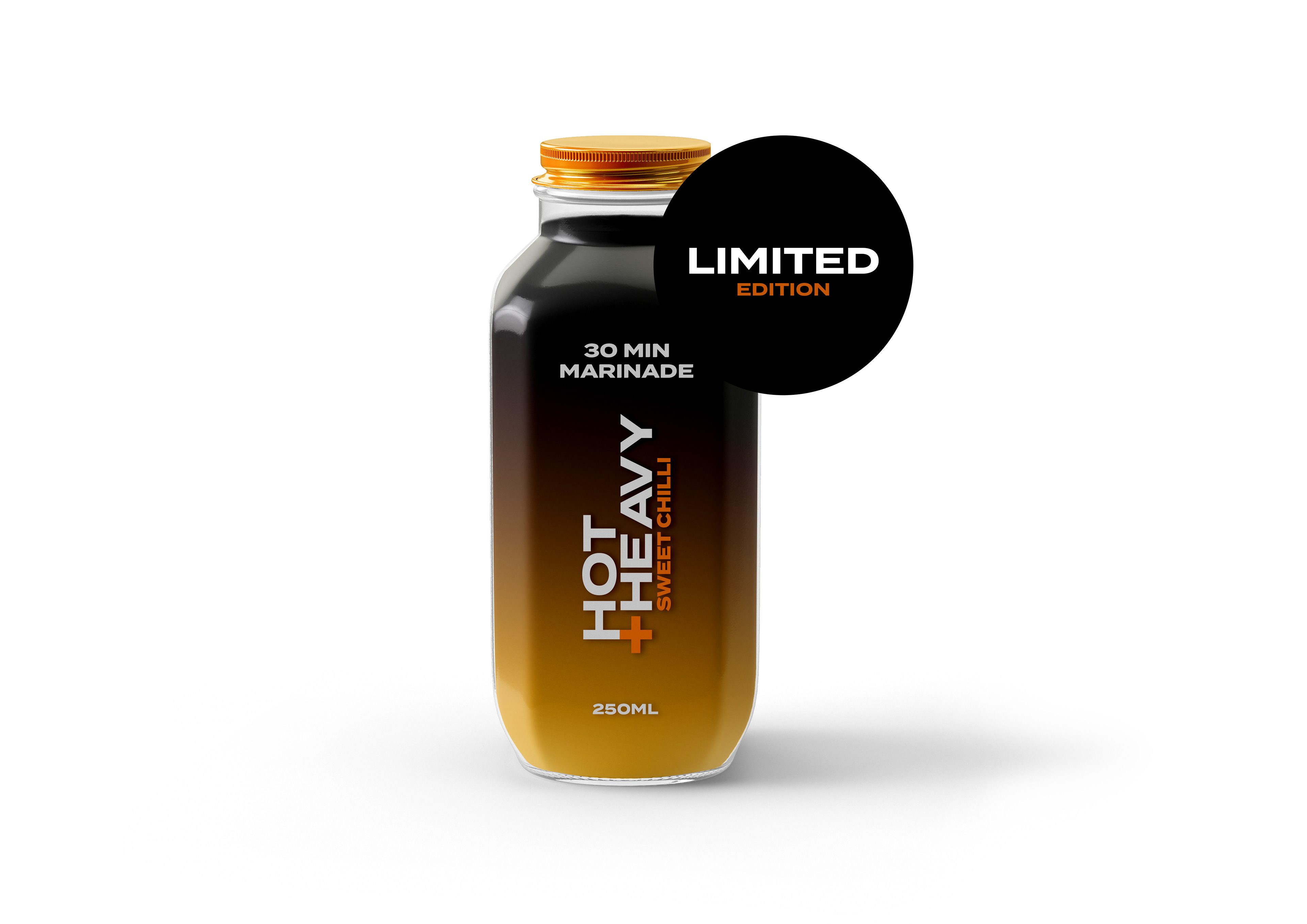
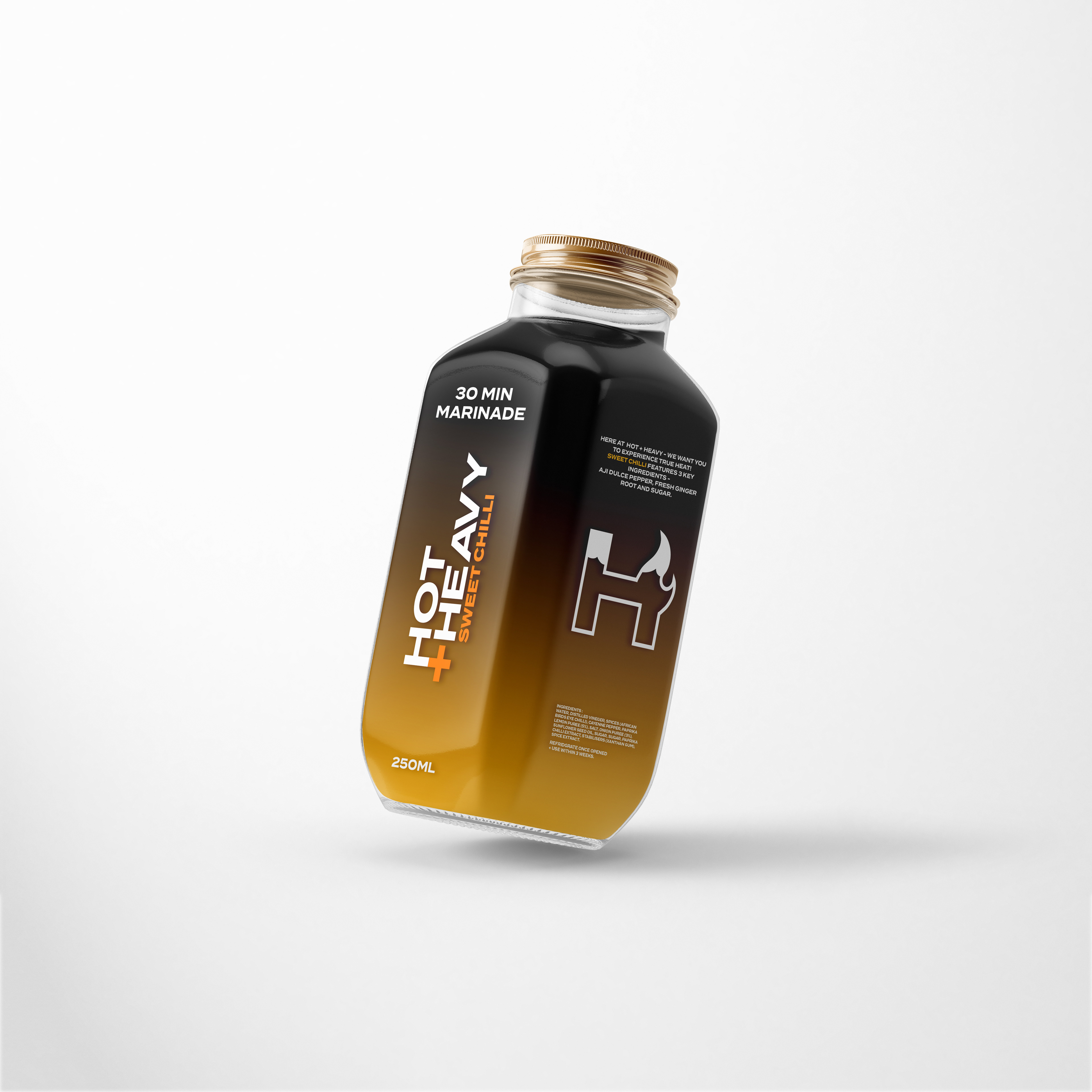
Once the brand identity and the flavour logos for the brand was produced, I started to design the packaging for the marinade/sauces. I felt it was important that the packaging looking consistent with each other but also different as the sauces were different flavours and needed to look different from one another. The colour scheme needed to be the same as the colour from the flavour logos and also the positioning of the logos and text on the bottle needed to be the same as well. I also developed a brand story for each of the flavours explaining the ingredients, the flavour of the marinade/sauce and also the experience you will take part in.
Below are physical mockups of the packaging.
Physical Mockups