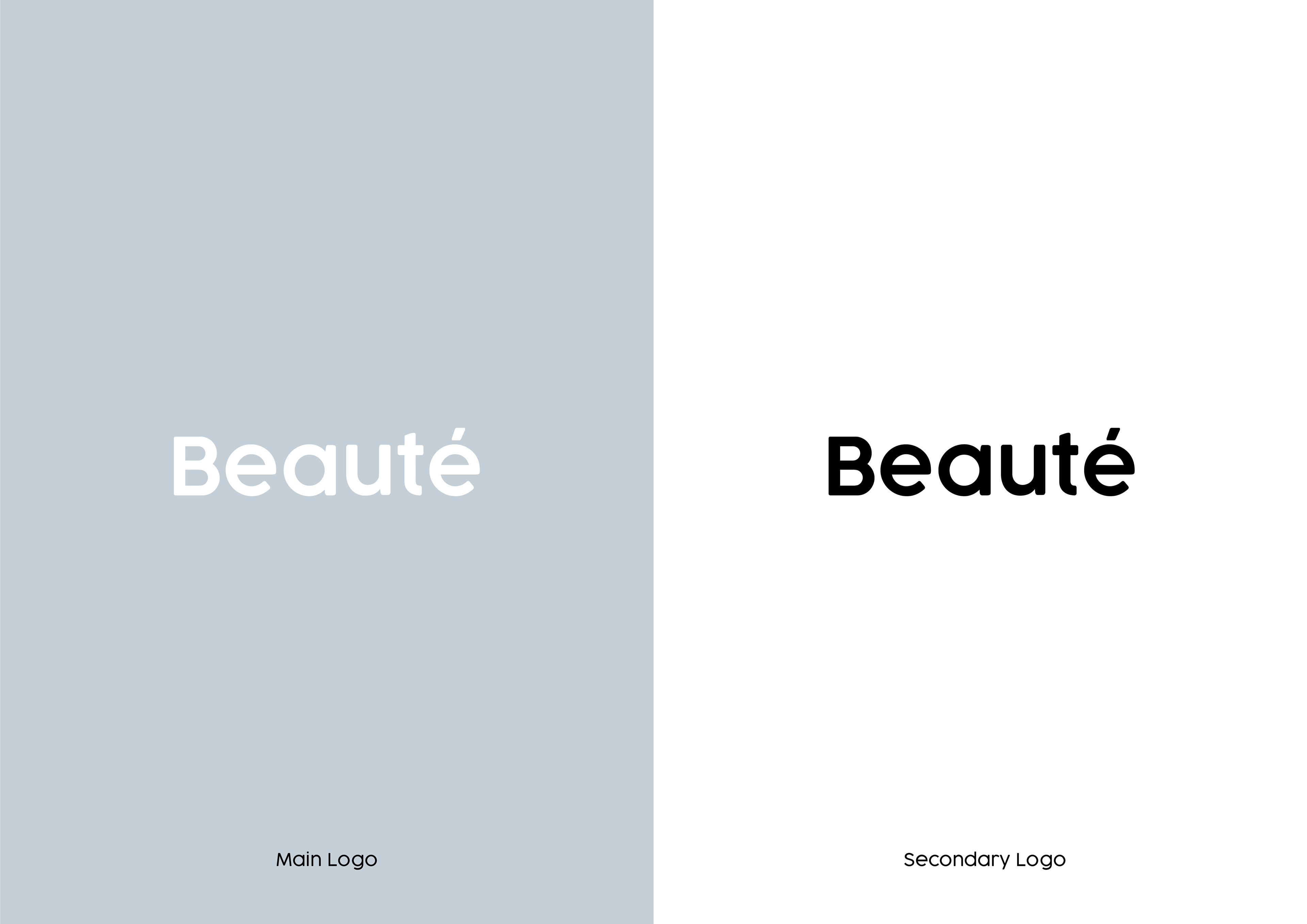
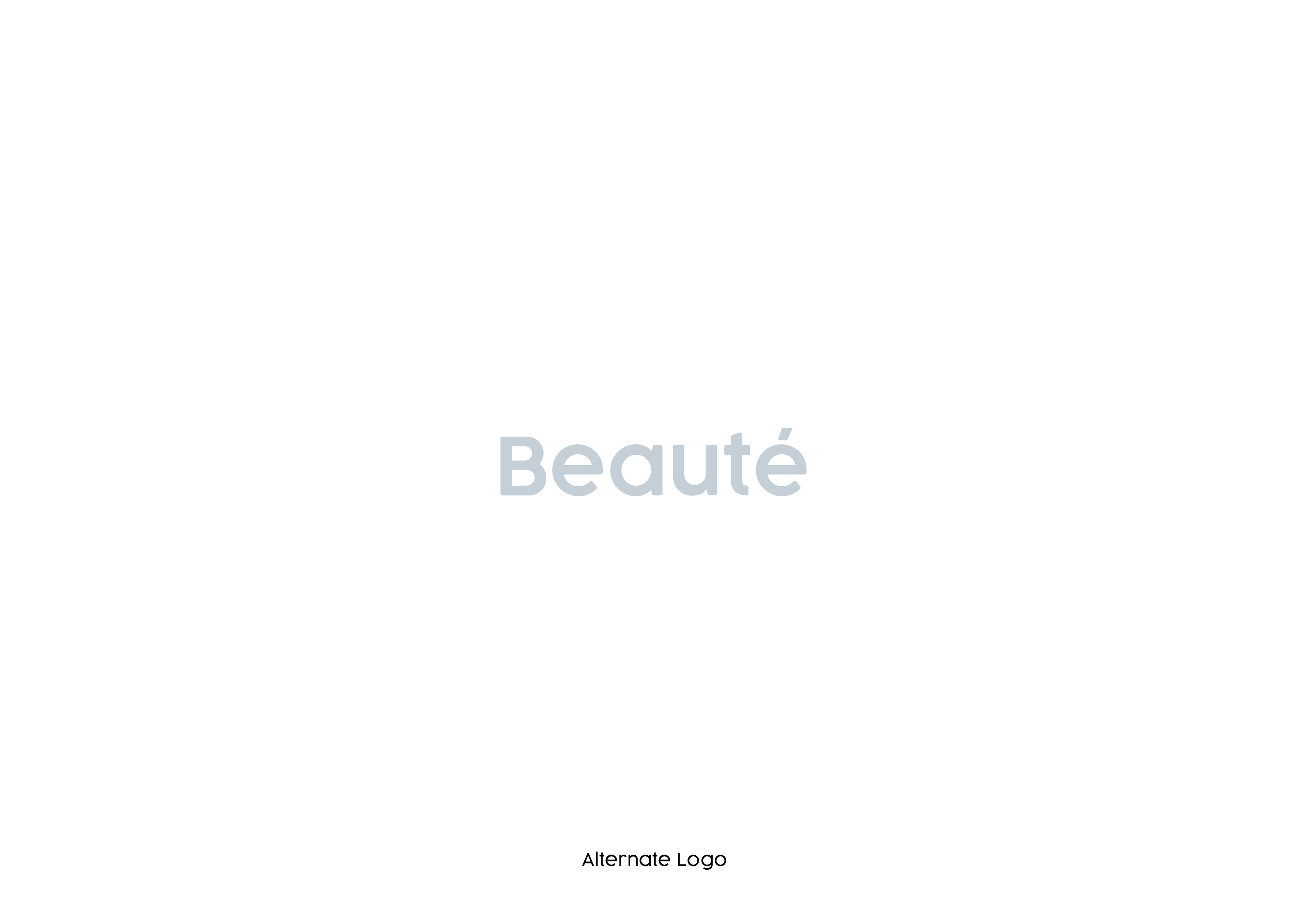
Beauté is a french skincare brand in which offers high-performance products to improve your skin health. Beauté wanted a brand design which followed a minimalistic style while using pastel colours for the packaging and the overall branding. To start this project I needed to produce a logo which spoke for the brand, the logo needed to make the brand feel professional and look/feel like a upper-market skincare brand. I felt a rounded typeface would work well for the brand as this makes the brand seem fun, easy going and most importantly professional. Below is the final logo with its alternations.
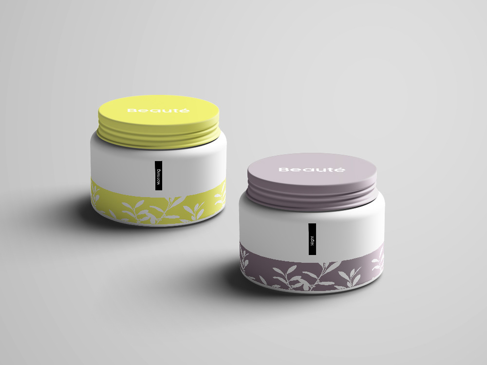
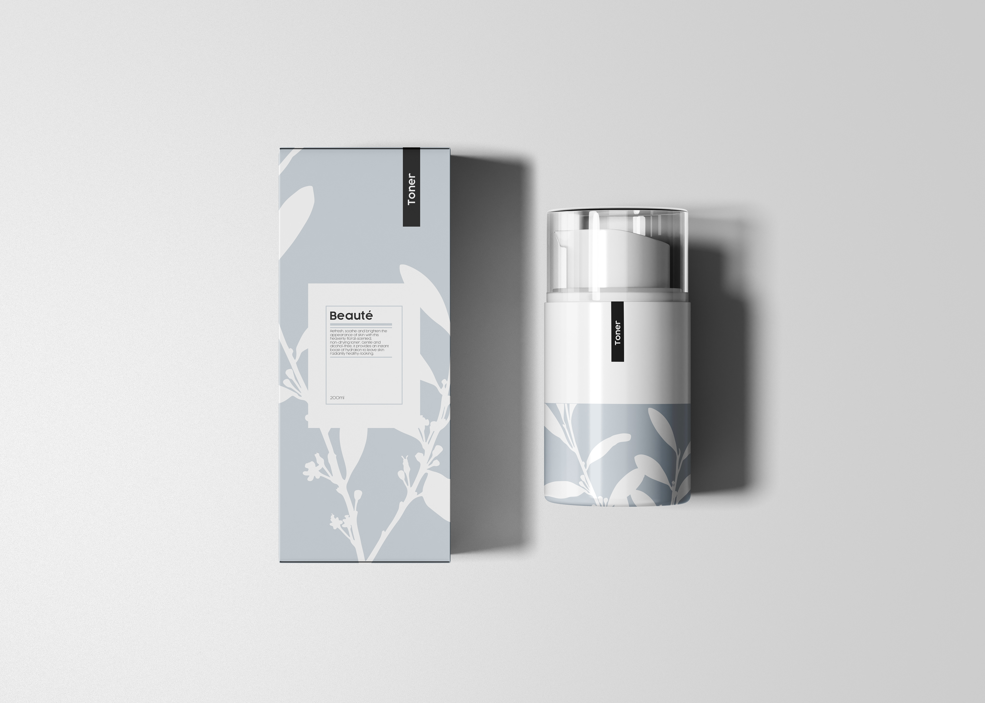
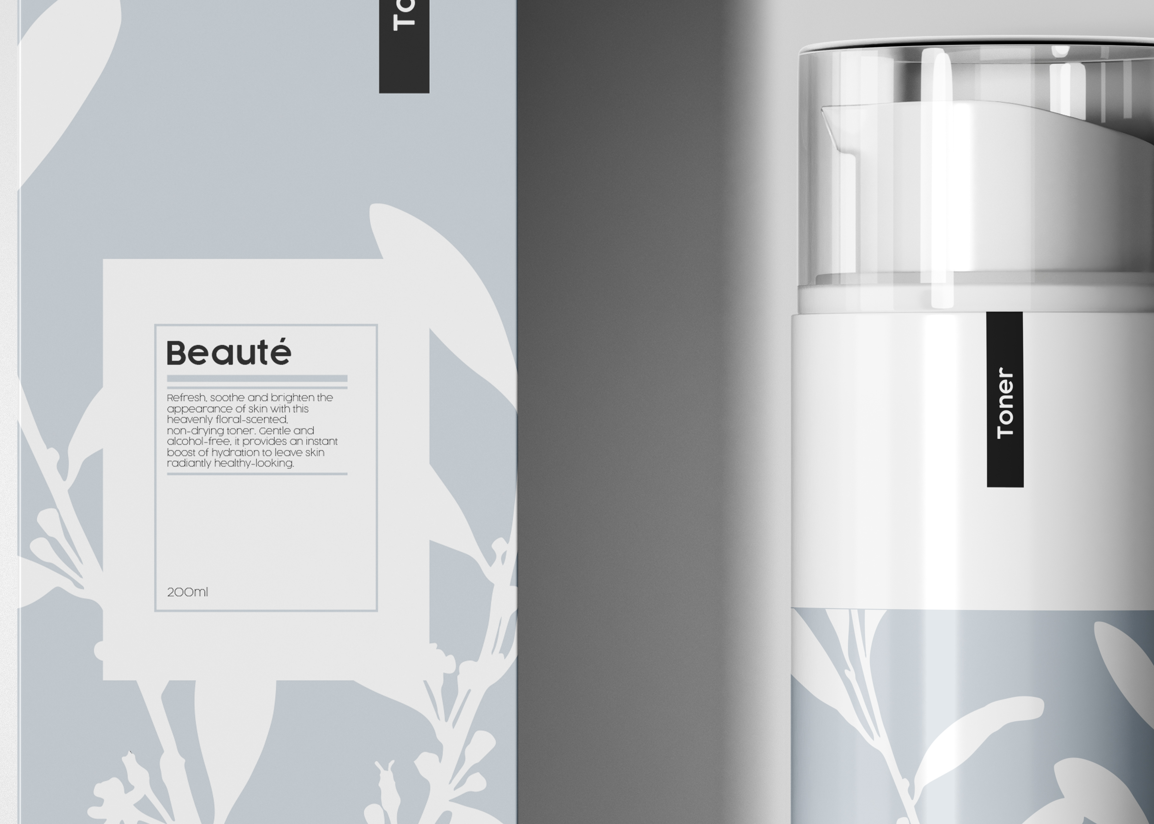
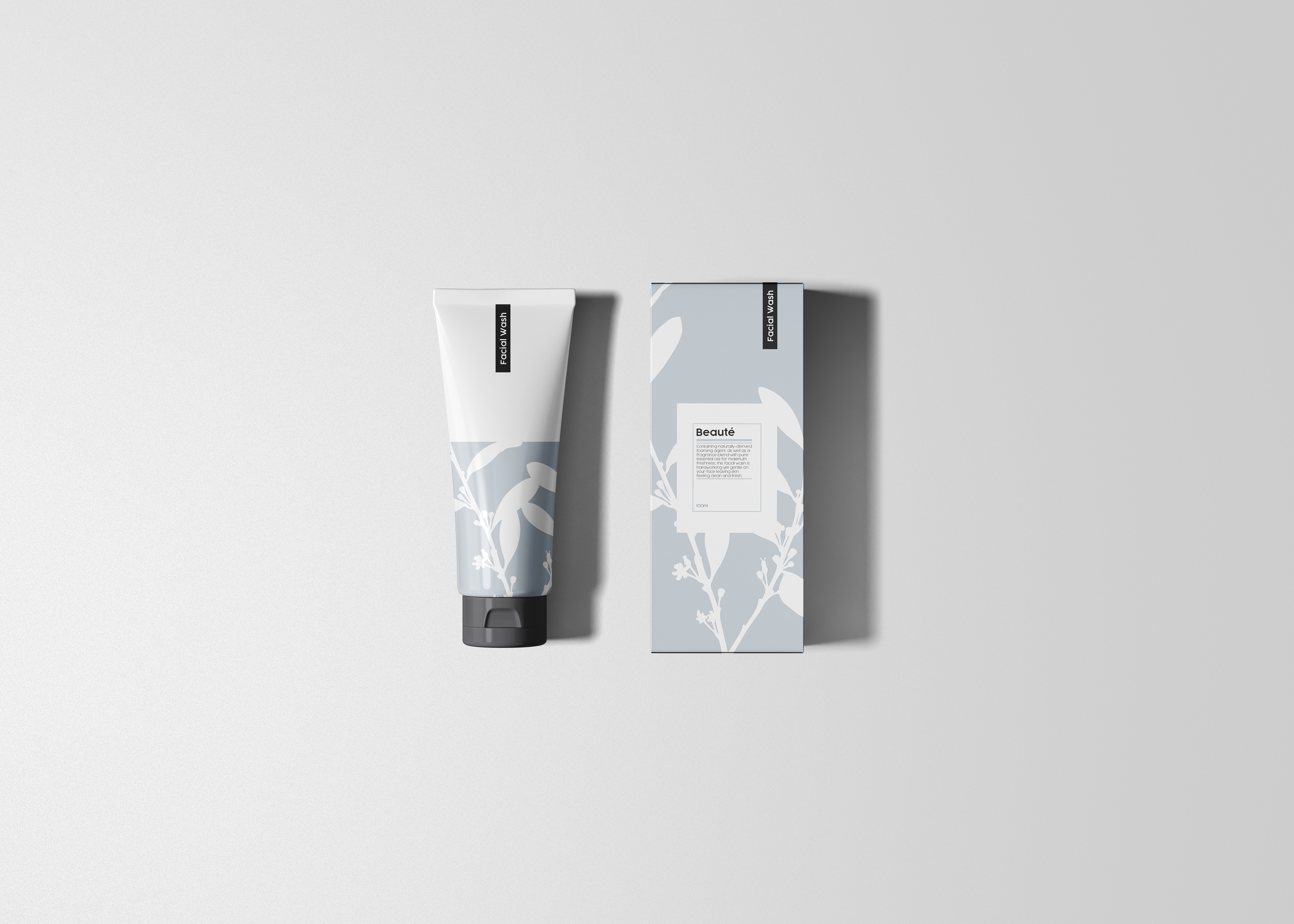
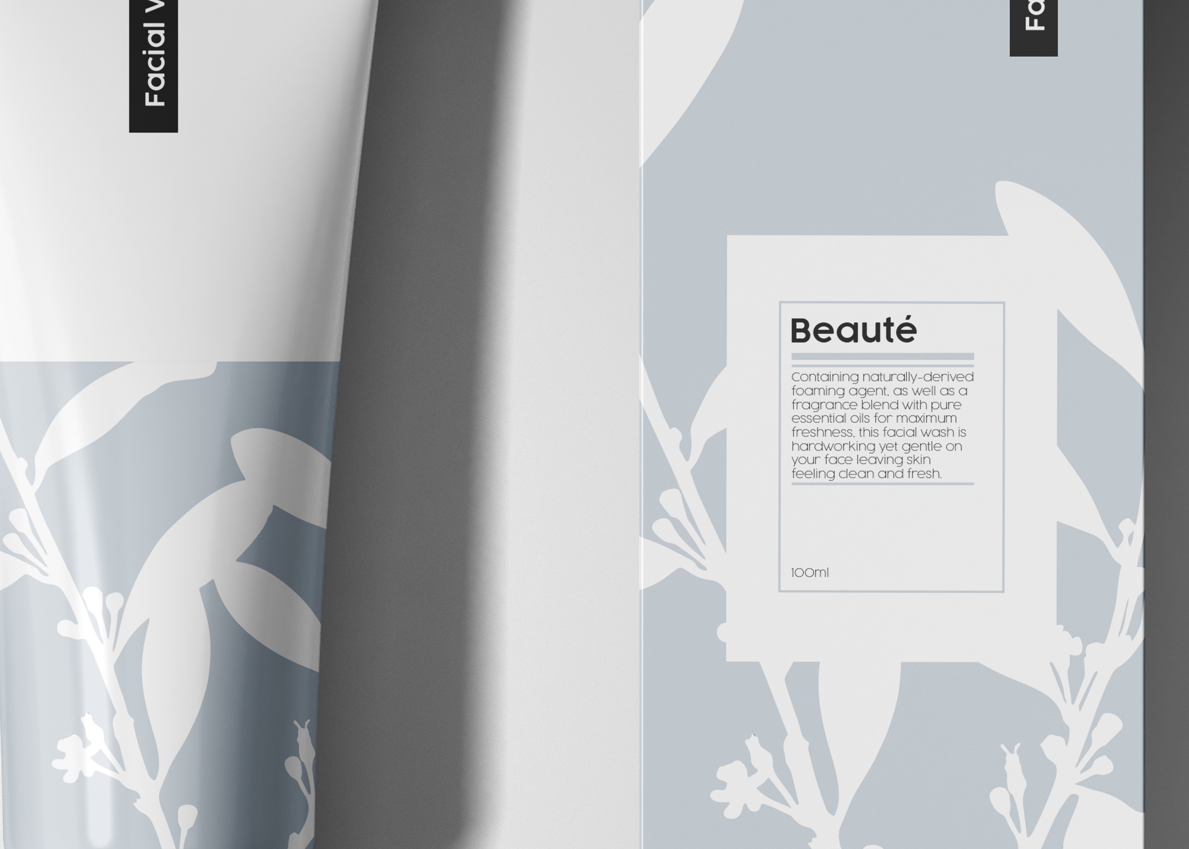
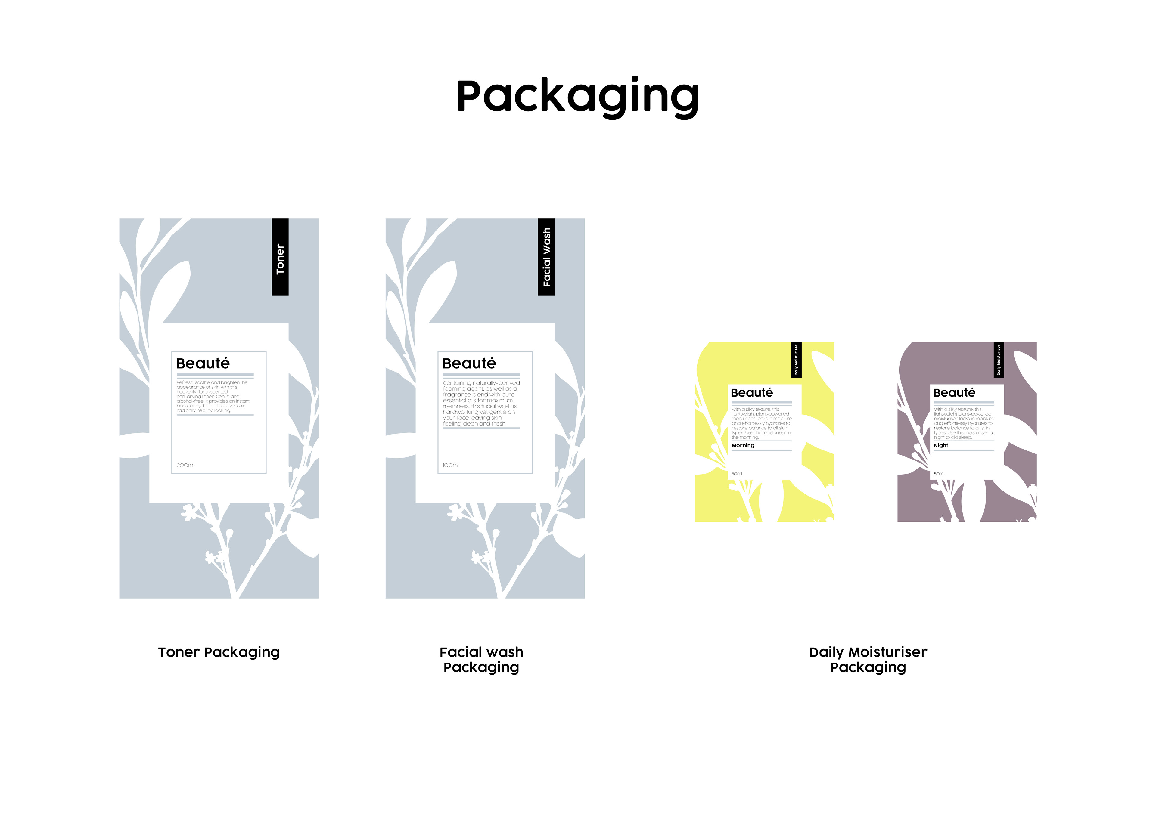
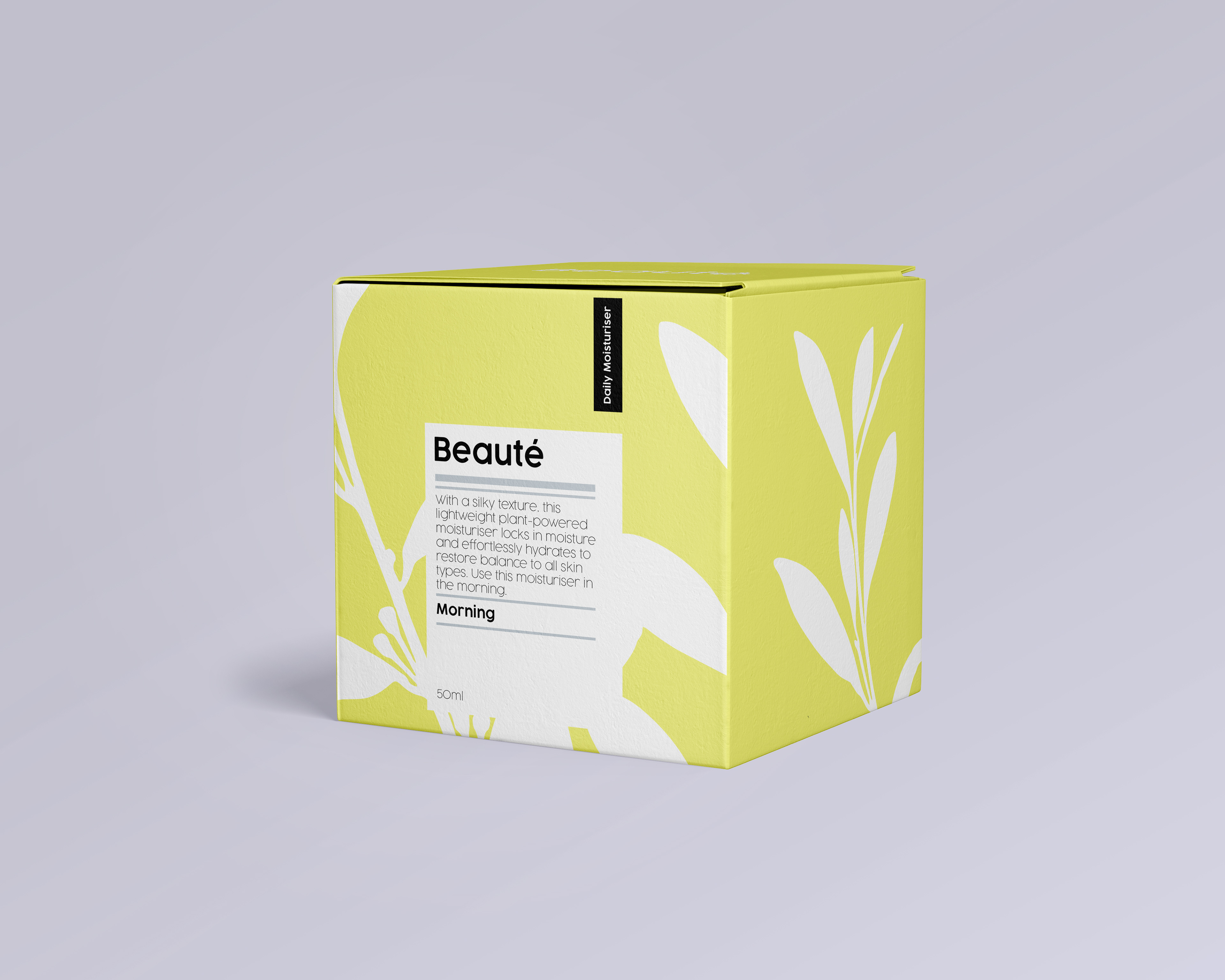
Moving on, as the logo was produced I started to work on the products and packaging. As Beauté only have three products for their skincare brand, I felt it was important for all three products to look consistent as the whole brand needs to look exactly the same through design. I felt it was important to use the same illustration (Leaf vine) throughout all the packaging due to the aforementioned idea of the brand being consistent. The only thing which wasn't consistent is the colour change from each of the product. Below is the flat images of the packaging and then followed by mockups to see how the packaging would look like in a real physical packaging scenario.
Packaging (Flat Image)
Physical Packaging (Mockup)


Inside Packaging (Cream Tub)